How to Build a Sales Dashboard That Actually Drives Results

“We’re drowning in HubSpot data, but we can’t trust the forecast or repeat the results,” Many sales leaders face this Dashboard or Sales Dashboard dilemma daily.
The numbers tell a compelling story. Sales leaders have access to simple sales metrics through their CRM dashboards – 93% of them do. Yet only 21% focus on the right activities to accelerate predictable revenue growth. This gap reveals a crucial reality in modern sales environments: data abundance doesn’t guarantee analytical insights.
Sales Dashboard must do more than display numbers to work effectively. They help sales and RevOps executives track goal progress, manage pipeline, spot issues, and create forecasts based on reliable data. Companies that properly implement KPI dashboards reap substantial rewards – 68% see their business performance improve.
This piece will guide you through building a sales performance dashboard that delivers real results. You’ll learn to select the right sales metrics and apply dashboard design best practices. Your overwhelming sales data will become applicable information. Let’s help your dashboard evolve from a neglected tool into your team’s competitive edge!
- What is a Sales Dashboard and Why It Matters
- Common Challenges in Sales Data Management for Sales Dashboard
- Key Elements of a High-Impact Sales Dashboard
- Essential Sales Dashboard Metrics to Track
- Designing a Sales KPI Dashboard That Gets Used
- Advanced Features That Drive Better Decisions
- How to Build and Launch Your Dashboard
- Measuring Success and Iterating Over Time
- Conclusion
- Key Takeaways
- FAQs
What is a Sales Dashboard and Why It Matters
The ever-changing world of sales demands quick, informed decisions that can make or break your targets and opportunities. A sales dashboard serves as an invaluable tool in this scenario.
Definition and purpose of a Sales Dashboard
A Sales Dashboard visually represents your latest performance metrics through graphs, charts, and numbers to give you a snapshot view of current sales performance. You can think of it as your company’s commercial operations control panel – similar to how a car’s dashboard displays vital signs that affect your driving.
These dashboards combine and simplify complex data from multiple sources, making it easy to understand for everyone from sales reps to executives. Your sales-specific data appears as understandable visual graphics, which helps teams save time and improves understanding, motivation, and accuracy.
Most effective sales dashboards include:
- Performance metrics (revenue generated, quota attainment)
- Pipeline data and deal stages
- Lead conversion rates
- Sales activity metrics (calls, emails, meetings)
- Customer retention figures
A sales dashboard differs from simple reporting because it knows how to present large amounts of data for in-depth intelligence. Good dashboards go beyond showing what happened, they help users understand why it happened and what steps to take next.
How Sales Dashboard supports sales performance
A properly implemented sales dashboard works like your “sales goal GPS”. It pinpoints your current position, distance from targets, and areas needing strategy adjustments.
Dashboards eliminate the impossible task of manually putting together sales analytics. Teams risk making critical human errors without a dashboard to analyze overwhelming amounts of data. So, managers can make analytical decisions instead of relying on guesswork.
Up-to-the-minute data analysis changes how teams operate. Sales managers can now:
- Track employee performance objectively
- Report accurate revenue figures to executives
- Monitor KPIs continuously
- Understand the current health of sales operations
Sales representatives benefit by monitoring their personal performance, setting task priorities effectively, and tracking progress toward sales targets.
Dashboards excel at providing early warning signals about potential issues. They offer one of the quickest ways to spot problems and promote action when leads get stuck at certain stages or specific reps show performance dips.
These tools help bridge communication gaps between departments. Modern CRMs let teams share dashboards throughout the business for maximum visibility, creating a central hub for sales operations. Teams can work from identical information, which helps arrange marketing, sales, and customer success teams better.
Dashboards make forecasting more accurate through continuous data flow, helping managers predict future outcomes confidently. Advanced sales dashboards now include AI-powered forecasting and predictive analytics to spot pipeline health issues before they affect revenue.
Sales dashboards fundamentally change how teams approach their work. They help move from reactive to proactive strategies, from opinion-based to data-driven decisions, and from isolated efforts to coordinated planning. This fundamental change in operational approach helps improve sales performance, allocate resources better, and create more predictable revenue growth.
Common Challenges in Sales Data Management for Sales Dashboard
Building a sales dashboard that works starts with knowing what might go wrong. Sales organizations invest heavily in collecting data but don’t deal very well with turning numbers into actionable insights. Let’s take a closer look at the main challenges that stop teams from getting the most value from their sales data.
Data overload and lack of clarity
Sales teams face an interesting problem today: they have too much data but not enough useful information. A recent global survey shows 90% of professionals work with data weekly. Yet two-thirds feel “anxious” about it, and 30% avoid it completely. This creates major roadblocks when making important decisions.
Enterprise sales teams often fall into the “swivel chair effect.” They switch between multiple data sources and copy information manually between processes. This creates several problems:
- Incomplete views of potential revenue opportunities and inefficient processes
- Time-wasting manual data collection prone to errors
- Slow decision-making because of information overload
The usual way of collecting every possible data point has backfired. Sales reps spend about 30% of their time switching between disconnected platforms. A whopping 40% use at least one full day each week to enter data manually and combine information from different sources.
Helix International points out that data isn’t just being handled, it’s burying us. This “datasandbox” creates separate customer views. Marketing, sales, and support see different versions of “the truth”. Without everyone on the same page, pipeline health becomes unclear, forecasting suffers, and opportunities slip away.
The price of this data mess hits hard. Thomas Redman reports that poor data costs companies between 15-25% of their total revenue. Companies also lose about 12% of their revenue due to bad data. Manual data collection and consolidation slows down decisions and introduces errors that hurt the bottom line.
Misaligned metrics and reporting gaps
Data volume isn’t the only issue. Organizations struggle when departments define and measure success differently. Sales and marketing teams often work toward different goals and key performance indicators (KPIs). Marketing teams focus on generating leads and measuring website traffic. Sales teams care about closing deals and meeting quotas.
This split creates real problems:
- Teams blame each other (marketing says sales doesn’t follow up; sales says marketing’s leads are poor)
- Different ideas about what makes a “qualified lead”
- Separate technology systems create information barriers
- Resources get wasted and messages become inconsistent
A Demand Gen Reports study shows that poorly aligned organizations suffer from bad communication and weak processes. Teams work against each other when they don’t share the same vision of success.
Companies that line up their sales and marketing efforts see their revenues grow by 20%. Success depends on everyone agreeing on definitions and measurements, while focusing on lead quality over quantity.
Reporting tools create their own challenges. Many tools show problems without offering solutions. Knowing about a performance gap isn’t enough, sales leaders must understand its location, cause, and solution.
Sales leaders still struggle with accurate forecasting despite having more data. They often base qualitative forecasts on static reports and manager opinions, rarely considering past performance. This makes it hard to spot and fix potential risks early, with little insight into forecast changes.
Sales dashboards must overcome these basic challenges to drive results. Understanding the problems of data overload and mismatched metrics helps organizations create dashboards that cut through the noise and provide truly useful information.
Key Elements of a High-Impact Sales Dashboard
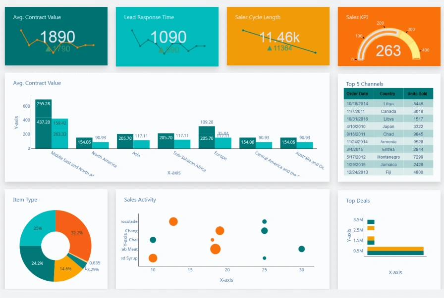
Image Source: Dashboard Builder
The thing is a Sales Dashboard ‘s success boils down to three most important elements. Just like your car’s dashboard shows exactly what you need while driving, a sales dashboard that works must balance rich information with easy understanding.
Visual clarity and simplicity of Sales Dashboard
Data visualization works best when it’s simple and clear. The golden principle of sales dashboard design couldn’t be clearer: if your data isn’t useful, it’s worthless. Too many metrics on a dashboard create confusion instead of insights.
Sales dashboards that work follow these visual design principles:
- Tell a cohesive story: Your sales dashboard should answer specific questions about your sales process with a layout that builds a strong narrative
- Simplify complicated ideas: Your team needs to see only the most important metrics they can act on
- Focus on necessity: Keep it to 6-10 data points per dashboard to avoid overwhelming users
- Create logical layouts: Start with high-level insights at the top and get more detailed as you move down
Color choices play a vital role in making dashboards work. Green highlights positive trends while red signals problems, which helps users understand information quickly. Larger fonts for key numbers make sure the most important information stands out.
Real-time data updates
Static dashboards become useless quickly. A dashboard with immediate updates changes how teams work by showing what’s working and what isn’t right away.
These dashboards refresh automatically as new data comes in, you don’t have to wait for processing or manual updates. Sales teams can spot trends, identify problems, and fix issues before they grow into bigger challenges.
To name just one example, your team can catch sudden drops in conversion rates right away instead of finding out next week. These quick insights help teams make faster, smarter decisions based on evidence.
Real-time updates come with these key features:
- Alerts that trigger when important changes happen
- Mobile notifications for team members
- Extra importance during critical times like quarter-end
Role-specific views
A one-size-fits-all dashboard ended up helping nobody. Teams work better with dashboards tailored to show exactly what each person needs.
Role-based dashboards help everyone find their relevant information and take action quickly. Each customized view follows these patterns:
- Executives see big-picture metrics about core sales KPIs, closed revenue, and performance trends
- Sales managers track team performance, coaching insights, and pipeline health
- Individual reps focus on personal performance and pipeline details
The executive dashboard might show revenue versus margin by salesperson as a complete picture, while reps see their activities and deals in progress.
Knowing how to filter dashboards by region, product line, segment, or campaign makes them even more valuable. Everyone from leadership to sales teams gets exactly what they need to succeed.
Your sales dashboard becomes a powerful decision-making tool that drives results when you combine these three vital elements visual clarity, immediate updates, and role-specific views.
Essential Sales Dashboard Metrics to Track
Your sales dashboard’s success depends on choosing metrics that matter, not just collecting vanity numbers. The best dashboards show numbers that directly affect revenue growth and team performance.
Pipeline velocity and deal slippage
Pipeline velocity shows how fast opportunities turn into revenue through your sales funnel. This key metric combines several variables to give you a clear picture of sales efficiency.
Pipeline Velocity = (Number of opportunities × Win rate × Average deal size) ÷ Sales cycle length
A healthy pipeline velocity helps predict when deals will become revenue. A slowdown might indicate bottlenecks that need quick attention. Sales teams need 3-4× pipeline coverage ratio to reach their targets with confidence.
Deal slippage measures opportunities that don’t close on time. Deals that keep moving from one quarter to another suggest problems with qualification or unrealistic forecasts. Top teams keep slippage under 20%. Sales leaders can spot priority deals and adjust forecasts by watching this metric.
Conversion rates by funnel stage
Your sales funnel’s conversion rates pinpoint where potential customers stop moving forward. This detailed view proves more useful than overall conversion numbers.
You can find stage-specific conversion rates by dividing opportunities that advance by total opportunities in each stage, then multiply by 100. This calculation reveals exact problem areas in your sales process.
B2B sales teams typically see conversion benchmarks of 1-3% from visitor to lead, 39% from marketing qualified lead to sales qualified lead, and 8-12% from trial to paid customer. These transition points show where teams need coaching and process improvements.
Win rates and average deal size
Win rate shows sales effectiveness by measuring what percentage of opportunities become closed deals. The calculation divides closed-won deals by total closed deals (both won and lost).
Most B2B organizations see 20-30% as a healthy win rate. Teams with higher rates often have better qualification processes and value selling approaches.
Average deal size tells you typical revenue per closed sale. The calculation takes total revenue from closed-won deals divided by closed deals. This number helps determine opportunity targets for revenue goals and shapes territory planning and quota setting.
Sales activity metrics
Daily behaviors lead to closed revenue, and activity metrics track these actions. These early indicators help predict future results before they appear in your pipeline.
Essential activities to watch include:
- Number of calls made and answered
- Emails sent and their response rates
- Meetings booked and conducted
- Follow-up interactions with prospects
These numbers reveal how engaged prospects are and measure sales performance. A rep might generate one opportunity per 20 calls, which helps predict activities needed for target achievement.
Customer retention and upsell rates
Customer retention rate shows what percentage of customers stay with you over time. Here’s the calculation:
Retention Rate = [(Customers at End − New Customers) ÷ Customers at Start] × 100
Excellent retention rates fall between 92-95%, showing customer satisfaction and stable recurring revenue. Getting new customers costs five to 25 times more than keeping current ones, making this metric crucial for profitability.
Net retention percentage combines customer retention with expansion revenue:
Net Retention = (Renewal ARR + Upsell ARR − Churn) ÷ (Target Renewal ARR)
Numbers above 100% mean expansion revenue from existing customers beats losses—a clear sign of sustainable growth and product-market fit.
These metrics turn your sales dashboard from a simple reporting tool into a powerful decision engine that drives predictable revenue growth.
Designing a Sales KPI Dashboard That Gets Used
Building powerful sales dashboards needs more than just collecting metrics, you need to create something people will actually use. My first dashboard looked like “a data explosion” with random charts and clashing colors everywhere. No one touched it because it was too much to handle. Let me help you avoid making the same mistake.
Color psychology and visual hierarchy
Colors can make your sales dashboard visualizations easier to understand. Users spot trends, patterns, and outliers more easily. Colors do more than just decorate they tell a story and guide where people look on your dashboard.
Research shows people judge visuals in just 90 seconds, and colors influence about 90% of that judgment. Here’s how different colors work on your dashboard:
- Blue: Creates trust and calm, works great for backgrounds or showing steady data
- Red: Shows urgency, perfect to highlight critical issues that need quick action
- Green: Shows growth and success, great for positive trends or progress
- Yellow/Orange: Brings energy, use it to draw attention to key metrics
Visual hierarchy makes important information stand out through smart use of size, color, and layout. Key metrics pop with bold colors while neutral tones provide the backdrop. Users can find critical information quickly without feeling overwhelmed.
Mobile optimization and responsiveness
Mobile dashboards have become essential for teams that want better data reporting. Sales teams now get vital insights anywhere they go.
Space matters most in mobile design. Phone screens work better with simple charts like pie or bar graphs instead of complex ones. Start with 4-5 KPIs per mobile view to keep text readable.
Mobile-optimized design works on any device. Field updates sync right to your CRM, so managers see field activities in real time. Field sales teams find this feature valuable when they need to record data on the move.
Your mobile dashboard should feel as natural as any other app on your phone. This familiar approach helps users learn faster and use it more often.
User-friendly layout and tooltips
Your dashboard’s layout can make or break its success. Grid layouts keep everything neat and answer the “Where do I look first?” question. Users naturally look at the top-left corner first, so put your most important metrics there.
Empty space on your screen helps too. It lets the information breathe and makes everything easier to read and more pleasant to look at.
Good tooltips give helpful extra details without overwhelming the view. Effective tooltips serve three purposes:
- Add context with more data points
- Make things clearer with explanations
- Help users explore more through navigation options
Tooltips work best when they’re quick to read. Users should grasp them in three to five seconds. Use different font sizes, bold text, or colors to show what’s important, but keep the information lean.
Most users miss tooltips because they’re hard to spot. Small arrows pointing to elements make it clear what each tooltip explains. This simple fix makes your dashboard much easier to use.
Advanced Features That Drive Better Decisions
Modern sales dashboards have evolved beyond static reporting tools. AI-enhanced dashboards now guide decision-making instead of just showing data.
AI-powered forecasting and alerts
Sales teams no longer rely on gut feelings for projections. AI forecasting looks at win rates, customer activity, and deal closure times to predict outcomes precisely. The numbers speak for themselves – 83% of sales teams using AI experienced revenue growth last year, while only 66% of teams without AI saw similar results.
AI probability scores update continuously, unlike traditional methods. The system updates right away when prospects engage more or competitors enter the scene, rather than waiting for the next report. Your team always has the latest information at hand.
AI does more than just predict – it sparks action through automated alerts. The system watches deals constantly and spots warning signs that humans might overlook. Your team gets notifications quickly when customer engagement drops or timelines change.
Predictive analytics for pipeline health
Predictive analytics changes how teams manage sales pipelines by spotting patterns in customer behavior, lead quality, and market conditions. Teams can focus on the most promising leads that need immediate attention.
Sales managers can stay ahead of issues by seeing sales trends and pipeline bottlenecks early. AI spots patterns in email responses, meeting attendance, content engagement, and past deals that humans might miss.
Success measurement comes from tracking forecast variance and deal closure accuracy – how well predictions match actual results.
CRM integrations and automation
Direct CRM integration means data flows automatically between platforms. Your team always works with accurate, current information. Manual data entry becomes a thing of the past, giving your team more time to sell.
Current integration options connect with Salesforce, Microsoft Dynamics 365, HubSpot, and other platforms. You get a complete view with useful insights from one central source.
Ready to upgrade your sales dashboard? Schedule your Business Intelligence Consultation Today to learn how these features can help your sales team predict instead of react.
How to Build and Launch Your Dashboard
A sales dashboard’s success depends on how well it helps your team make decisions. Here’s a practical guide with five steps to create a dashboard your team will actually use.
Step 1: Connect your data sources
Your sales dashboard needs reliable, connected data to work. Start by finding where your sales metrics come from, it could be one CRM or several platforms. Most teams store their data in multiple systems like CRM, call tracking, customer service, and marketing automation tools.
The next step is connecting these sources to your dashboard platform. Today’s dashboard tools come with direct integrations with popular platforms like Salesforce, HubSpot, and Microsoft Dynamics. You can use CSV imports or API connections if your sources lack native connections.
Step 2: Define your KPIs and goals
You should identify the most important metrics before creating visualizations. Ask yourself: “Who will use this?” and “Which sales KPIs matter to them?”. Different roles need different metrics, executives want high-level insights, while sales reps need activity-focused KPIs.
Pick metrics that link directly to revenue outcomes. Don’t pack too many metrics into one dashboard. This makes the dashboard easier to understand and use.
Step 3: Choose the right dashboard tool
The best dashboard software should meet these five criteria:
- Data connections: Can it easily connect to your systems?
- Design flexibility: Will it create user-friendly visuals?
- Technical requirements: Do you need specialists to run it?
- Accessibility: How will your team view dashboards (TV screens, mobile, embedded)?
- Budget: Look at upfront costs, per-user pricing and data refresh fees
You can pick from visualization tools like Tableau or Power BI, CRM-native dashboards, or specialized sales dashboard platforms.
Step 4: Build and test your dashboard
A clean layout with grouped metrics works best. Put your most important KPIs at the top-left where eyes naturally land first. Use green for positive trends and red for warnings. Each dashboard should show only 6-10 data points.
Let real users test your dashboard before full launch. The dashboard needs work if users can’t grasp it within five seconds.
Step 5: Train your team and roll it out
The best dashboard won’t help if nobody uses it. Show your team how to use the dashboard and explain its benefits. You can boost visibility by scheduling automated snapshot reports to inboxes.
Check and update your dashboard every quarter to keep it useful. Schedule your Business Intelligence Consultation Today to get expert help in building dashboards that deliver results.
Measuring Success and Iterating Over Time
The value of a sales dashboard depends on how much your team uses it. Your team needs to actively use the dashboard to get results, regardless of how sophisticated the data analysis might be. Launching the dashboard is just the beginning – it marks the start of a continuous improvement journey.
Tracking adoption and usage
Your team’s dashboard usage patterns need careful monitoring to track access frequency and popular sections. Analytics tools help track user login activity across different channels and job roles. This information shows who engages with your dashboard and points out teams or individuals who might need additional support.
The next step involves analyzing which metrics get the most attention compared to rarely viewed ones. User adoption analytics highlight active users and frequently used objects. This knowledge helps you decide if certain dashboard elements need redesign or removal.
Gathering feedback from users
User feedback gives a great way to get insights about dashboard effectiveness. Here are some approaches to try:
- Schedule regular feedback sessions for users to share experiences
- Create simple surveys about dashboard clarity and usefulness
- Watch how team members use the dashboard in ground situations
This input helps you understand what users value most and areas that need improvement. Note that dashboards exist to help teams make confident decisions with trusted data.
Updating metrics and visuals regularly
Your business growth should mirror in your sales dashboard. Quarterly reviews and updates ensure it stays relevant. This maintenance helps sales reps and managers get the information they need to succeed.
Throughout this process, remember to Schedule your Business Intelligence Consultation Today to provide expert guidance on optimizing your dashboard’s performance and adoption.
Conclusion
Sales dashboards are without doubt more than just data visualization tools. They act as a navigational compass for your entire sales operation when built right. This piece explores how effective dashboards turn overwhelming data into useful insights that drive business results.
The most powerful sales dashboards strike a balance between simplicity and depth. Your dashboard should tell a clear story quickly and let users explore details when needed. The focus should be on metrics tied directly to revenue outcomes rather than tracking everything possible.
Personalization makes these tools more effective. Role-specific views help executives, managers, and individual reps get the exact information they need to make confident decisions. Immediate updates turn your dashboard from a static report into a dynamic decision engine that spots problems before they affect revenue.
The work continues after implementation. Good Business Dashboards grow through consistent feedback and iteration. Your team should tell you what works and what doesn’t. A dashboard that nobody uses has zero value whatever its sophisticated analytics might be.
Creating an effective sales dashboard needs time and careful planning, but the results speak for themselves. Teams with well-implemented dashboards show better performance, more accurate forecasting, and smoother coordination between departments.
Keep it simple at first. Focus on metrics that matter most to your business goals and refine them based on usage patterns. Your sales dashboard will become a vital tool that drives results instead of gathering digital dust.
Key Takeaways
Building an effective sales dashboard requires strategic focus on actionable metrics rather than overwhelming data displays. Here are the essential insights for creating dashboards that drive real business results:
• Focus on 6-10 critical metrics maximum – Limit dashboards to essential KPIs like pipeline velocity, conversion rates, and win rates to prevent information overload and increase usability.
• Design role-specific views for maximum adoption – Create customized dashboards for executives (big-picture metrics), managers (team performance), and reps (personal activities) to ensure relevance.
• Implement real-time updates with automated alerts – Enable immediate visibility into performance changes and deal health issues before they impact revenue outcomes.
• Prioritize visual clarity with strategic color psychology – Use green for positive trends, red for warnings, and maintain clean layouts with key metrics in the top-left corner.
• Connect all data sources and ensure mobile optimization – Integrate CRM systems, marketing platforms, and other tools while designing responsive interfaces for field access.
• Measure adoption rates and iterate based on user feedback – Track dashboard usage analytics and regularly update metrics quarterly to maintain relevance and drive continuous improvement.
The most successful sales dashboards transform from passive reporting tools into dynamic decision engines that guide teams toward predictable revenue growth through data-driven insights.
FAQs
Q1. What are the key elements of an effective sales dashboard? An effective sales dashboard should include visual clarity with a simple layout, real-time data updates, and role-specific views tailored to different team members’ needs. It should focus on 6-10 critical metrics that directly impact revenue outcomes.
Q2. How often should I update my sales dashboard? It’s recommended to review and update your sales dashboard quarterly to ensure it remains relevant and aligned with your business objectives. Regular maintenance allows your team to continuously receive the insights they need to succeed.
Q3. What metrics should I include in my sales dashboard? Essential metrics to track include pipeline velocity, conversion rates by funnel stage, win rates, average deal size, sales activity metrics, and customer retention rates. Focus on metrics that directly tie to revenue outcomes and avoid overwhelming the dashboard with too much information.
Q4. How can I increase adoption of my sales dashboard? To increase adoption, create role-specific views, implement real-time updates with automated alerts, ensure mobile optimization, and regularly gather feedback from users. Track usage analytics and iterate based on user input to continuously improve the dashboard’s effectiveness.
Q5. What role does AI play in modern sales dashboards? AI enhances sales dashboards through features like AI-powered forecasting, predictive analytics for pipeline health, and automated alerts. These capabilities help teams make data-driven decisions, anticipate sales trends, and identify at-risk deals before they become obvious problems.