How to Create Powerful Data Visualizations best practices for Beginners

The human brain processes images almost sixty thousand times faster than text, this visual processing superpower explains why Data Visualization and Data Visualizations Best Practices has become crucial for modern businesses. Well-designed dashboards boost business intelligence by turning raw data into meaningful insights. Companies that use effective BI tools like dashboards are twice as likely to experience improved decision-making capabilities and see a 24% increase in revenue growth.
Making effective visualizations needs more than just putting numbers into colorful charts. Users abandon 80% of websites that don’t load within 3 seconds. This same impatience applies to understanding your data. The five-second rule stands as a core principle of data visualization best practices – users must find needed information within 5 seconds of viewing your dashboard.
In this piece, we’ll explore best practices for data visualization that help create professional dashboards delivering useful insights quickly. You’ll learn everything from picking the right chart types to applying dashboard design best practices. These fundamentals will help beginners turn complex data into clear, compelling stories that lead to better business decisions.
Table of Content
Start with Your Audience and Goals
“Data visualization is the language of decision making. Good charts effectively convey information. Great charts enable, inform, and improve decision making.”
Dante Vitagliano, Data Visualization Thought Leader
Your data visualization’s success starts long before you pick colors or chart types. You need to know your audience and set clear goals. These steps will determine if your visualization simply shows data or helps people make decisions.
Start with Your Audience and Goals
Define the purpose of your visualization
Each data visualization needs a specific job. Harvard Business Review groups visualizations into four main purposes: idea generation, idea illustration, visual discovery, and everyday dataviz. You should know what story your data needs to tell before making any chart. Do you want to show a concept, find patterns, or track how well something works? Your answer shapes everything that follows.
Strategic planning sessions work better with visualizations that help generate ideas and show what people care about. Project managers often use Gantt charts to show their processes and workflows. Whatever the purpose, your visualization should help people take action within their roles.
Your visualizations will work better when they connect to what leadership values. Skip technical details like dashboard usage or system uptime. Instead, show business priorities like customer lifetime value or revenue growth.
Identify your audience’s data literacy
The way you present data changes based on who sees it. Data visualization literacy (DVL) means knowing how to read, interpret, and understand visual data representations. Research shows that most people don’t read data visualizations well, even though companies need these skills more than ever.
These questions matter:
- Who will look at this visualization?
- How comfortable are they with different data formats?
- What will they do with the data they see?
Different people process information in their own way. Data analysts can handle complex visualizations, but executives might want simpler displays with clear explanations. Technical teams like charts with lots of variables. Non-technical people do better with clean designs and easy-to-read labels.
Map visualizations to business questions
Data creates value only when it solves business problems. Turn big strategic goals into specific questions that your visualizations can answer. This step helps connect your data work to real-life results.
Your visualizations should match what your organization cares about. Help viewers understand why certain data points matter by giving them context. People make better decisions when they can compare current performance against clear targets or key performance indicators.
Show your visualization to a small group from your target audience before sharing it widely. Their feedback helps you make changes that improve understanding and results.
Good data visualizations do more than show information—they make people act and help them decide. This happens when you know your purpose, understand your audience’s skills, and connect everything to business questions before you start designing.
Choose the Right Chart Type
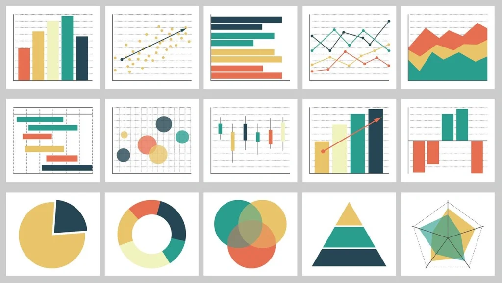
Image Source: Vexpower
Your choice of visualization format makes all the difference after you identify your audience and goals. The right chart type can clarify insights while the wrong one might hide them completely.
Choose the Right Chart Type
Bar, line, and pie charts: when to use each
Bar charts shine at comparing data across categories and show differences quickly. They work best when your data splits into multiple categories such as product sizes, referral sources, or departmental spending. People can see differences between values accurately and quickly because these charts encode values through bar length from a baseline. You should use them to:
- Compare values across distinct groups
- Show differences between categories
- Display historical highs and lows at a glance
Line charts connect data points to show ongoing progress, which makes them perfect for tracking changes over time. Research shows that line charts outperform bar charts when you need to visualize smaller changes or trends. These charts excel at:
- Showing data trends over continuous periods
- Revealing patterns that help make predictions
- Displaying multiple related metrics at once
Pie charts should be used carefully, even though they’re common. They work best when you want readers to focus on part-to-whole comparisons. In spite of that, getting an accurate sense of slice sizes becomes hard because pie charts lack value markings around their perimeter. These charts work best when you:
- Keep the number of pie wedges small
- Need to show proportions as your main goal
- Use them to support other visualizations
Avoiding misleading visuals
Even accurate charts can mislead by accident. Some common practices can distort how people see your data:
Bar charts should start at zero. Non-zero baselines can make differences between bars look more dramatic than they are. Starting axes at zero helps maintain accuracy unless you have a good reason not to.
Colors need careful planning. Sharp contrasts between colors like dark blue and light yellow can make value changes look more dramatic than they are. Too little contrast might hide important differences.
The shape of your chart matters by a lot. Changing a chart’s size to fit a slide can twist the story it tells. Small changes in aspect ratio might flatten an upward trend or make tiny gaps look huge. Keep your proportions steady to protect data accuracy.
You should show complete data ranges. Picking only favorable intervals might tell a neat story but hides the full picture. Show complete timelines when possible or explain why you focused on specific periods.
Using KPIs and trend indicators effectively
Key Performance Indicators (KPIs) give visual signals about progress toward measurable goals. A good KPI visual needs three things: a base measure that gives a value, a target measure or value, and a threshold or goal.
KPIs help you:
- Review progress (showing what’s ahead or behind)
- See how far you are from goals (measuring the gap to targets)
Bullet charts add context to single bars with extra markings. You’ll usually see a line showing targets and background shading that provides performance measures. These charts pack multiple metrics into a small space effectively.
Your trend indicators should show both current position and direction. Line charts with clear data points tell you where things are headed, especially when you add goal lines or measure zones for context.
The right visualization matches your data type perfectly. Good charts deliver instant understanding, while poor choices just create confusion.
Design with Clarity and Simplicity
“You can achieve simplicity in the design of effective charts, graphs and tables by remembering three fundamental principles: restrain, reduce, emphasize.”
Garr Reynolds, Author, Presentation Zen
Visual clarity makes the significant difference between visualizations that communicate well and those that leave viewers confused. After picking the right chart types, you should focus on the design itself.
Design with Clarity and Simplicity
Use layout patterns that guide the eye
People naturally look for patterns that show important information quickly. The layout of your visualization should follow arrangements that make sense. Your visualization should match how people read – left to right in many languages. The most important elements belong at the top or upper left corner where people start looking.
Keep your visualization to three or four views. Too many views will bury the big picture in details. On top of that, it helps to keep the order consistent when using multiple charts. Clear connections between related data points help viewers stay oriented.
Limit visual clutter and non-data ink
Edward Tufte, a visualization pioneer, gave an explanation of “data-ink ratio” – how much of a graphic’s ink shows actual data versus decorative elements. You want to maximize this ratio by removing what Tufte calls “chartjunk” – unnecessary elements that pull focus from the data.
Common chartjunk problems include:
- Too many gridlines and tick marks creating visual noise
- 3D effects that distort data perception
- Decorative backgrounds or images
- Redundant labels or information
Whitespace isn’t wasted – it gives breathing room that helps important elements pop. Start by removing elements that don’t help understanding. Get rid of extra borders, repeated labels, and decorative pieces. As you redesign, think about whether each element helps people understand the data or just looks pretty.
Apply the 5-second rule for key insights
Research shows modern attention spans for online content are nowhere near five seconds. You have about five seconds to grab viewers before they move on. Your visualization must tell its story in this short time.
A quick way to test your visualization is to show it to a colleague for five seconds. Ask them: “What was the main point? What stood out first? What is this telling us?”. Your design works if their answers match your intended message.
Clear titles and simple instructions help maximize five-second comprehension. Tell viewers what the visualization shows and how to use it. We focused on creating patterns people recognize right away – familiar visualization formats let viewers extract meaning faster.
Use Color and Size to Emphasize Meaning
Your viewers’ interpretation of data depends on how you use color and size in your charts and layouts. These visual elements can guide attention and boost understanding when you apply them thoughtfully. Poor usage leads to confusion and misinterpretation.
Color theory basics for data
Color does more than decorate it shapes how people feel and process information. Research shows the right colors can improve understanding by up to 80%. Data visualization uses three main color palette types:
- Qualitative palettes: You’ll need distinct hues for categorical data without inherent order (countries, departments). Keep it to 10 or fewer colors to maintain distinctiveness.
- Sequential palettes: These show ordered numerical values through lightness variations. Lighter colors typically represent lower values, while darker ones show higher values.
- Diverging palettes: Two contrasting hues meet at a neutral midpoint to highlight deviations from a central value.
Your color choices should line up with common perceptions to work best. Red signals urgency or warnings, while blue creates trust. This alignment helps viewers grasp information quickly.
Avoid redundant color usage
Gray might be your most valuable color in data visualization. It makes highlighted colors pop when used for less important elements. Gray works as a storytelling tool colored elements grab attention instantly against a gray background.
Keep your palette to seven or fewer colors in one visualization. This matches how many items our brain can process at once. You should check your visualization in grayscale, your color strategy works if the main points remain clear.
About 8% of males and 0.5% of females have some form of color-vision deficiency. Tools like ColorBrewer and Coblis help you pick and test color schemes for accessibility.
Use size and shape to show value differences
Size offers a powerful way to emphasize meaning. Your important categories stand out among many unimportant ones through size variations. Size indicators work exceptionally well with maps, making data points easier to spot.
Pre-attentive attributes, visual elements your brain spots without conscious effort include both color and size. You should pick techniques that make your target data points noticeably different from other elements.
Add Interactivity and Context
Interactive features turn static visualizations into powerful analytical tools. Your design fundamentals create the foundation, and adding layers of interactivity improves data comprehension significantly.
Enable drill-downs and filters
Drill-downs let users move from high-level summaries to granular details with a simple click. Report viewers can switch between pages filtered to specific values. A click on a product category could show detailed performance metrics for products within that category.
These steps help create effective drill-downs:
- Create dedicated pages that display detailed information about single items
- Configure clear navigation elements like buttons with descriptive tooltips
- Ensure consistent field names when enabling cross-report functionality
Use tooltips and annotations
Tooltips provide contextual information without cluttering your primary visualization. Small boxes appear when users hover over chart elements and display additional details at the right moment. They help create meaningful yet clean visualizations by showing definitions, formulas, or extra context.
Effective tooltips can:
- Include dynamically generated content like tables or charts
- Incorporate interactive JavaScript actions
- Provide guidance through descriptive labels or help icons
Incorporate customer journey analytics or churn prediction
Advanced visualization techniques like customer journey analytics turn raw data into clear visuals that simplify complex customer behaviors. These elements help businesses spot friction points, improve touchpoints, and create better customer experiences.
Churn prediction visuals help teams take proactive steps by identifying at-risk customers. A well-designed churn dashboard tells a clear story, showing customer retention rates, their value, and concerning patterns in different segments.
Conclusion
Data visualization turns complex information into meaningful insights that help make better business decisions. This piece explores core principles that make visualizations work.
You must understand your audience’s data literacy level as it forms the basis of any visualization project.
The right chart choice whether bar charts for comparisons, line charts for trends, or carefully chosen pie charts, substantially improves understanding without misleading viewers.
Simple designs help viewers learn key insights within five seconds. Colors guide the eye and highlight important data points. Interactive elements let users explore information layers based on their needs. Beautiful charts serve little purpose if they fail to communicate effectively, so balance visual appeal with functional clarity.
Practice and refinement develop visualization skills over time. Start small by applying one or two principles from this piece. Once you become skilled at the basics, advanced techniques like customer analytics or predictive visualizations naturally follow. We offer tailored guidance if you face specific business data challenges – schedule a consultation today.
Data visualization combines science with art. Technical precision matters as much as creative thinking. Your visualizations should tell compelling stories that appeal to viewers while maintaining data integrity. Well-executed visual stories turn raw numbers into actionable insights. This leads to smarter, faster, and more confident decisions across your organization.
Key Takeaways
Master these essential principles to transform complex data into compelling visual stories that drive better business decisions and enhance organizational performance.
• Start with purpose and audience: Define clear visualization goals and match complexity to your audience’s data literacy level before choosing any chart type.
• Match chart types to data stories: Use bar charts for comparisons, line charts for trends, and limit pie charts to part-to-whole relationships only.
• Apply the 5-second rule: Design with clarity and simplicity so viewers can grasp key insights within 5 seconds of viewing your visualization.
• Use color strategically: Limit palettes to 7 colors maximum, leverage gray for less important elements, and ensure accessibility for color-blind users.
• Add interactive layers thoughtfully: Implement drill-downs, tooltips, and filters to enable deeper exploration without cluttering the primary view.
• Eliminate chartjunk ruthlessly: Remove decorative elements that don’t contribute to understanding and maximize your data-ink ratio for clearer communication.
Remember that effective data visualization balances technical accuracy with creative storytelling. Start with these fundamentals, practice consistently, and gradually incorporate advanced techniques as your skills develop.
FAQs
Q1. What are the key elements to consider when creating data visualizations? The key elements to consider are understanding your audience, defining clear goals, choosing appropriate chart types, designing with simplicity, using color strategically, and adding interactivity when necessary. It’s crucial to match the complexity of your visualization to your audience’s data literacy level and ensure that key insights can be grasped within 5 seconds.
Q2. How can I make my data visualizations more effective for decision-making? To make data visualizations more effective for decision-making, focus on clarity and simplicity in design. Use layout patterns that guide the eye, limit visual clutter, and apply the 5-second rule for key insights. Additionally, map your visualizations to specific business questions and provide sufficient context to help viewers understand why certain data points matter.
Q3. What are some common mistakes to avoid in data visualization? Common mistakes include using inappropriate chart types, creating misleading visuals with non-zero baselines or distorted aspect ratios, overusing color, and adding unnecessary decorative elements (chartjunk). It’s also important to avoid overwhelming viewers with too much information and to ensure that your visualization is accessible to color-blind users.
Q4. How can I use color effectively in my data visualizations? Use color strategically by limiting your palette to seven or fewer colors, using gray for less important elements to make highlighted colors stand out, and choosing appropriate color schemes for your data type (qualitative, sequential, or diverging). Always consider color accessibility and test your visualizations in grayscale to ensure the main points still stand out.
Q5. What role does interactivity play in data visualization? Interactivity transforms static visualizations into powerful analytical tools. Features like drill-downs, filters, and tooltips allow users to explore data at different levels of detail, provide context without cluttering the main view, and enable deeper insights. However, it’s important to implement these features thoughtfully to enhance rather than complicate the user experience.